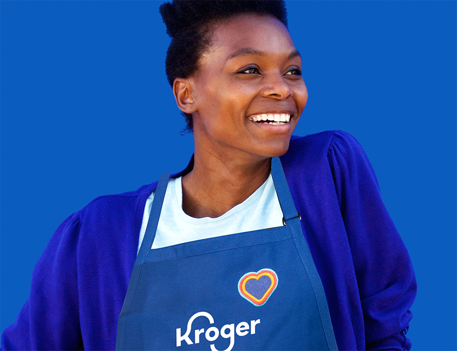
FRESH FOR EVERYONE™
Did you know the average person makes 221 food related decisions every day? As America’s grocer, we believe that everyone deserves to have access to fresh, affordable and delicious food, no matter who you are, how you shop or what you like to eat.

We are fresh that stands out.
At the heart of it, food can and SHOULD be fresh, so our new brand has been designed to stand out by being optimistic, bright, welcoming and above all fresh.

Logo – A contemporary evolution
The contemporary evolution of the redesigned Kroger logo reflects the company’s strong, food-rich heritage by retaining the shape and movement of the iconic “K” and “G” loved by generations of Kroger customers.
Tagline – Kroger’s uniquely egalitarian American brand
Fresh for Everyone is Kroger’s brand ethos. The universal tagline is simple and designed to drive an instant understanding of the uniquely egalitarian American brand, underscored by Kroger’s commitment and belief that everyone should have access to fresh, affordable and delicious food.

Primary Brand Color – Blue signals Kroger heritage, safety and trust
Blue has been and will continue to be Kroger’s signature color. Blue represents the Kroger brand heritage of food savvy and signals safety and trust to customers.

Color Accent Palette – Bright and modern, and signifies fun and inclusion
The Kroger brand features a bright and modern palette of accent colors reflective of the fun and inclusive spirit of the campaign.

Animation – Lovable “Kroji” characters keeps Kroger fun and relatable
Animation is Kroger’s fresh creative medium to market, connect and differentiate. The Kroji (Kroger + emoji) animation features a loveable cast of characters to represent Kroger customers, associates and communities in an inclusive, relatable, optimistic and fun way.

Fresh Cart – An iconic launch
The “Fresh Cart” icon is the embodiment of our brand’s purpose and promise to feed the human spirit by making fresh food accessible to all. The Fresh Cart combines two core Kroger Family equities, innovation and fresh, into one. The shopping cart is a symbol that has become synonymous with the grocery experience. Our cart was created using the curve of our K to represent our dedication to continually improving the shopping experience, no matter how you like to shop. The citrus wedges symbolize a commitment to Fresh that goes beyond food. At Kroger, “Fresh” is an approach to everything we do, and a feeling we hope to inspire in our customers. Moving forward, this icon will complement our existing Kroger Family Brand assets including the logo and tagline, and it will serve as a consistent visual unifier across our banners, services, modalities, and experiences.

Thoughtful Hosts – Living Kroger’s brand for exceptional customer experience
Kroger’s nearly half a million associates live its brand promise by helping make customers’ lives easier. No matter how someone shops, Kroger is committed to delivering fresh food at a fair price, simplifying customers’ shopping experiences and meaningfully giving back to its communities through Zero Hunger | Zero Waste, the brand’s bold social impact plan to end hunger in its communities and eliminate waste across the company by 2025.
Family of Companies – Same great banners, unified under Fresh for Everyone
Kroger’s 20+ retail banners across America will continue to operate under their existing names, incorporating the new brand attributes.


Advertising Campaign – Dialing it up
Kroger is launching a mass media campaign to amplify its new brand transformation. Advertising channels include retail, television and radio broadcast, digital, print, social, podcast, cinema, outdoor, and TV and music streaming services.


